The Brief
TrubAI needed a brand that could exist in two worlds simultaneously: the technical rigor of municipal SaaS platforms and the human-centered intelligence of behavioral analytics. Their existing logo worked on paper but failed on screen—where their product actually lives. They needed materials that could command attention in investor meetings and integrate seamlessly into product dashboards.
Brand Development
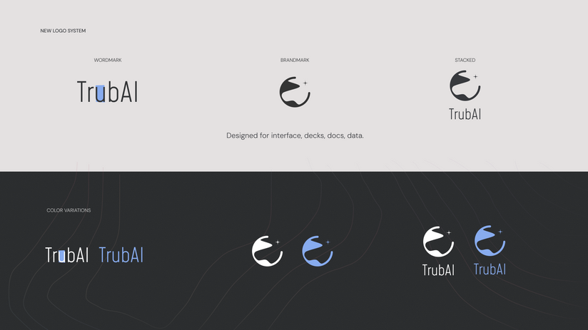
Logo System for Digital-First Use
Designed a complete logo kit built for dashboards, maps, and real-
time data tools. The brandmark pulls from urban planning shapes and
predictive symbolism—clean, flexible, functional. Created wordmark,
standalone brandmark, and stacked configurations. Every variation
optimized for interface clarity without competing with complex data
visualizations.
Typography That Signals Structure
Mohave gives the brand sharp, intentional presence—structured like urban planning itself. DM Sans balances with clarity and accessibility. Together, they suggest organized, forward-thinking intelligence without clinical coldness. Hierarchy system: Mohave for headings, DM Sans for subtitles, body, and captions at specified weights.
Color Architecture for Data + Emotion
Built a spectrum inspired by human decision-making patterns.
Neutrals create room for data density. Accents guide attention across
states and layers: primary UI, hover states, alerts, overlay fields, night
mode readability. The palette supports both presentation clarity and
live product functionality.
Visual Language Across Contexts
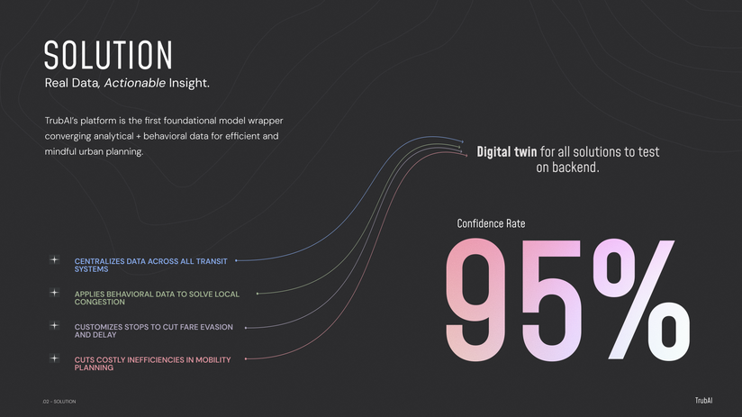
Developed graphical elements that reflect how the platform interprets the world: gradients representing data flow, planning lines showing structure, layered forms capturing system-and-signal relationships. Imagery moves between macro (city as system) and micro (human as signal).
12-Slide Investor Narrative
Structured deck for escalating conviction: Problem (urban challenges)
→ Solution (integrated data platform) → Competitive Advantage
(unique positioning) → Market (TAM/SAM/SOM visualization) → Team
→ Traction (pilots, partnerships, grants) → Product → Revenue Model
→ Use of Funds → Contact.
Pitch Deck Architecture
Data Visualization for Credibility
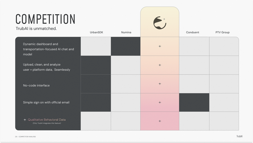
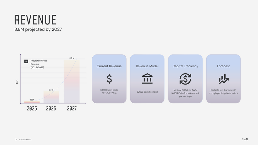
Designed custom competitive analysis matrix showing clear positioning across key features. Created market opportunity circles with clear visual hierarchy. Revenue projections as gradient bar charts. Platform architecture diagram showing system layers—every data point designed for immediate comprehension.
Visual Consistency Across All Materials
Applied brand system throughout deck: gradient backgrounds on key slides, icon system for feature callouts, color-coded data points, consistent spacing, and typography hierarchy.
Deliverables
-
Complete logo system: wordmark, brandmark, stacked configurations, color variations
-
Full color palette with hex specifications for UI states, presentation use, gradient applications
-
Typography system: Mohave + DM Sans with exact sizing, weights, hierarchy rules
-
Visual language guidelines: graphical elements, gradient usage, imagery direction
-
12-slide pitch deck with custom diagrams and data visualizations
-
Comprehensive brand identity documentation


